CSS Flexbox vs. Grid: Which One Should You Use?
When building a website, choosing the right CSS layout technique is essential. Two of the most popular tools for arranging page content are CSS Flexbox and CSS Grid. Both offer powerful ways to design responsive and flexible layouts, but they serve different purposes depending on your design goals. This guide will help you understand the differences and decide which one to use.
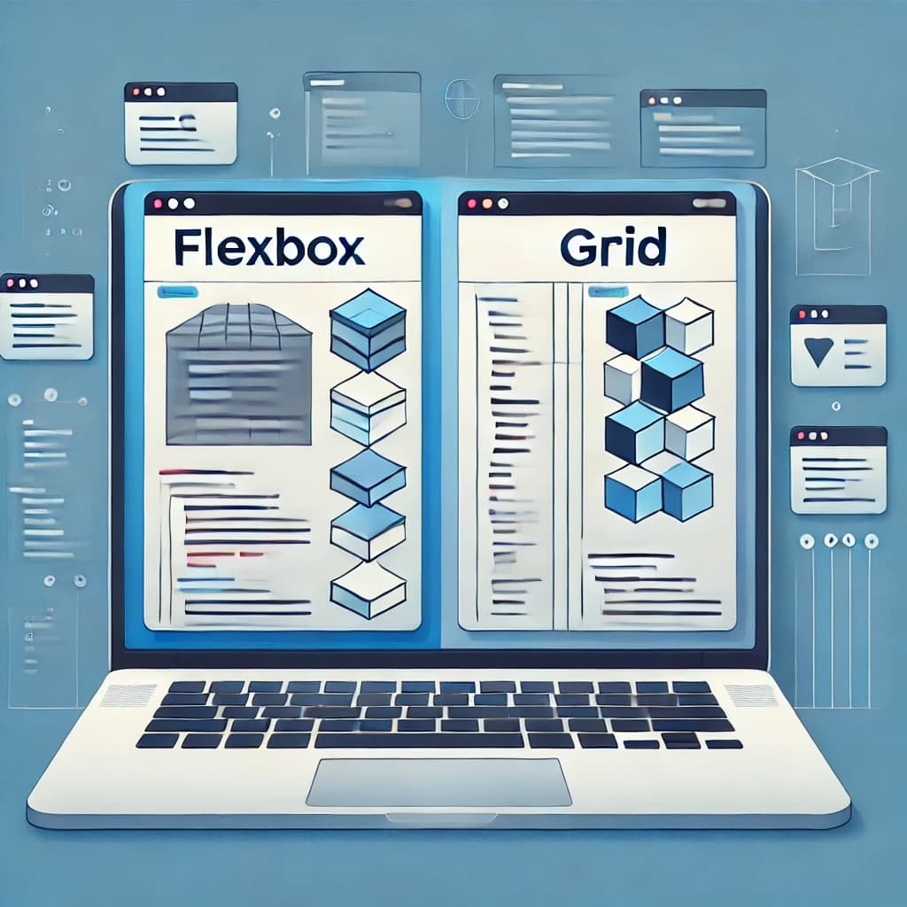
What Is CSS Flexbox?
Flexbox (Flexible Box Layout) is designed for managing layout in one dimension: either a row or a column. It excels at aligning items along a single axis, making it ideal for UI components such as navigation bars, form controls, or groups of buttons.
Why Use Flexbox?
-
Content-Driven Layouts: Flexbox adjusts elements dynamically based on content size.
-
Space Distribution: Properties like
flex-grow,flex-shrink, andflex-basislet you control how space is shared between items. -
Alignment Control: Use
align-items,justify-content, andalign-selffor precise positioning. -
Best for UI Elements: Great for small-scale layouts, such as toolbars, menus, and cards.
For a comprehensive Flexbox tutorial, visit MDN’s Flexbox guide.
What Is CSS Grid?
CSS Grid offers a two-dimensional layout system, allowing control over both rows and columns simultaneously. It’s perfect for creating complex page layouts, dashboards, and large-scale designs.
Why Use Grid?
-
Explicit Grid Control: Define row and column sizes with
grid-template-rowsandgrid-template-columns. -
Simplify Complex Layouts: Use
grid-template-areasto name sections for easier management. -
Layering and Overlapping: Place items in specific grid areas, even overlapping them with
grid-areaandz-index. -
Ideal for Page Layouts: Suited for multi-column or full-page designs.
Explore more with CSS Tricks’ Grid guide.
How to Choose Between Flexbox and Grid
Use the following guidelines to determine which layout system fits your project best:
| Scenario | Recommended Layout |
|---|---|
| Layout with a single row or column | Flexbox |
| Layout requiring control of both rows and columns | Grid |
| Layout adapting dynamically to content size | Flexbox |
| Layout fitting into a predefined grid structure | Grid |
| Flexible UI components (buttons, navbars, etc.) | Flexbox |
| Complex, scalable page layouts | Grid |
Can You Use Both Flexbox and Grid?
Absolutely. Many modern websites combine CSS Grid for the overall page framework with Flexbox inside components to manage alignment and spacing. Learning both tools allows you to build flexible, efficient, and maintainable layouts.
Mastering both Flexbox and Grid empowers you to create responsive and clean web layouts. Choose Flexbox for linear, content-driven designs and Grid for structured, two-dimensional layouts. At Qwerkly, we specialize in crafting custom web solutions using the best CSS layout strategies tailored to your needs.
Ready to build your next project with expert CSS layouts? Contact Qwerkly today for professional web development services.