CSS Basics: A Beginner-Friendly Guide to Styling the Web
CSS Basics: A Beginner-Friendly Guide to Styling the Web
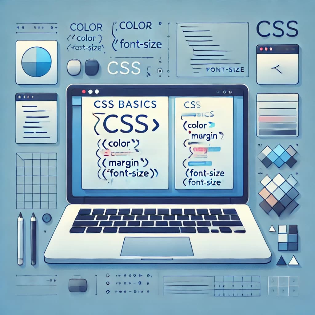
Introduction
CSS (Cascading Style Sheets) is one of the core technologies of the web. It empowers developers and designers to control the visual presentation of websites—from typography to layout and responsiveness. If you’ve ever wondered how websites achieve their look and feel, CSS is the tool behind the curtain.
In this beginner-friendly guide, we’ll cover foundational CSS concepts like selectors, specificity, the box model, modern layout systems (Flexbox, Grid), and best practices—everything you need to style with confidence.
CSS Selectors and Specificity
a. Common Selector Types
CSS selectors target HTML elements for styling. Some of the most commonly used selectors include:
-
*(Universal Selector): Targets every element. -
element(Type Selector): E.g.,p,h1,div. -
.classname(Class Selector): Targets elements with a specific class. -
#idname(ID Selector): Targets a unique element by its ID. -
[type="text"](Attribute Selector): Targets elements by attribute. -
:hover,:focus,:nth-child(n)(Pseudo-classes): Target elements in specific states. -
::before,::after(Pseudo-elements): Target parts of an element. -
Combinators (
>,+,~): Define element relationships.
Want to explore more? CSS Tricks’ selector guide offers a deep dive.
b. Understanding Specificity
When multiple rules apply, CSS uses specificity to decide which rule wins:
-
Inline styles:
style="..."have the highest priority. -
IDs (
#id) outrank classes and tags. -
Classes, attributes, and pseudo-classes fall in the middle.
-
Type selectors and pseudo-elements have the lowest weight.
-
The universal selector
*has almost no weight.
Tip: Confused why a rule isn’t applying? Use a specificity calculator to troubleshoot.
Box Model and Element Flow
The Box Model
Every HTML element is a rectangular box consisting of:
-
Content – The element’s inner text or child elements.
-
Padding – Space between content and border.
-
Border – Optional visible outline.
-
Margin – Space outside the element.
Box Sizing
By default, width includes only content. With box-sizing: border-box;, padding and borders are included in the width—making layout management easier.
More on this at MDN Web Docs.
Display & Positioning
Key values to understand:
-
Display:
block,inline,flex,grid, etc. -
Position:
-
static: Default flow. -
relative: Offset from itself. -
absolute: Positioned inside the nearest positioned ancestor. -
fixed: Stays in place on scroll. -
sticky: Switches from relative to fixed based on scroll.
-
Layout Techniques
Flexbox (1D Layout)
Use Flexbox for flexible row or column-based layouts.
-
justify-content: Aligns horizontally. -
align-items: Aligns vertically. -
flex-wrap: Allows items to wrap.
Get hands-on with CSS Tricks’ Flexbox Guide.
CSS Grid (2D Layout)
Use CSS Grid for complex grid-based structures.
-
Define rows/columns.
-
Use
grid-areaandgrid-template-areasfor layout control.
Try Grid by Example for interactive lessons.
Float (Legacy Layout)
Though outdated for layout, float is still used occasionally:
To prevent layout issues:
CSS Best Practices
To write clean, scalable CSS:
-
Use Variables:
--primary-color: #0A84FF; -
Organize Code with Methodologies: BEM, OOCSS, SMACSS.
-
Avoid Overusing
!important -
Use Media Queries: Make your designs responsive.
-
Minimize Performance Issues: Avoid overly complex selectors and unnecessary reflows.
More guidance: web.dev’s performance checklist.
Mastering CSS starts with a strong foundation. By understanding how selectors, specificity, the box model, and modern layout techniques work, you’ll be able to build stylish, responsive, and accessible websites.
Want help modernizing your website or application’s front end?
Contact Qwerkly to build performant, maintainable designs with us.